
Hey there, fellow art enthusiasts!
Today, we’re diving into the colorful world of color psychology—how different hues can shape our moods and perceptions, especially in the realm of art. Whether you’re a seasoned artist or just starting, understanding color psychology can add a new dimension to your work. So, let’s explore how these vibrant tools can influence the way we feel and see the world.
The Basics of Color Psychology
Color psychology is the study of how colors affect human behavior and emotions. It’s fascinating how a simple splash of color can evoke feelings of joy, calm, or even anxiety. This concept is widely used in marketing, design, and art to create specific emotional responses and to convey messages more effectively.
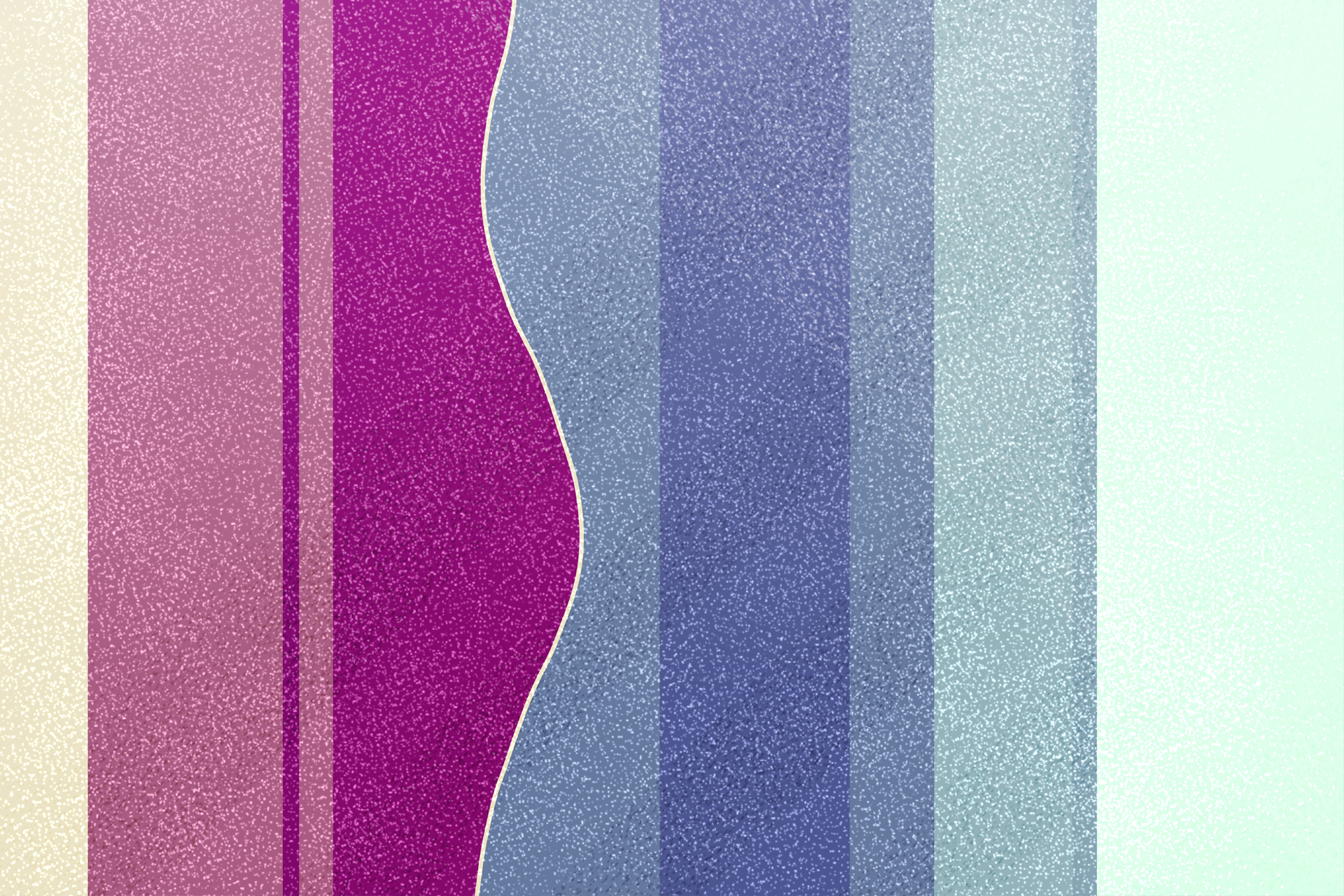
The Emotional Spectrum of Colors
- Red: Often associated with passion, energy, and excitement. It’s a powerful color that can stimulate the senses and evoke strong emotions. Think about how you feel when you see a vibrant red sunset or a bold red painting—it’s hard not to be moved!
- Blue: Known for its calming and soothing effects. Blue can create a sense of peace and tranquility, making it a popular choice for bedrooms and spaces designed for relaxation. In art, blue can convey depth and serenity.
- Yellow: The color of happiness and optimism. Yellow is bright and cheerful, often used to grab attention and lift the spirits. It’s like a burst of sunshine on a canvas, bringing warmth and positivity.
- Green: Symbolizes nature, growth, and harmony. Green is refreshing and restorative, often used to create a sense of balance and rejuvenation. It’s the color of life and renewal, perfect for evoking a sense of calm and well-being.
- Purple: Associated with creativity, luxury, and spirituality. Purple has a mysterious and magical quality, often used in art to evoke a sense of wonder and imagination.
- Black and White: While not colors in the traditional sense, black and white play crucial roles in art. Black can signify power, elegance, and sophistication, while white represents purity, simplicity, and tranquility. Together, they create striking contrasts and can convey a wide range of emotions.
Applying Color Psychology in Art
As an artist, I’ve always been fascinated by how colors can transform a piece of work. When I’m designing logos or visual identities for individuals, organizations, or companies, I carefully choose colors that align with their values and the emotions they want to evoke.
For instance, when working with a wellness brand, I’ll often incorporate shades of green to emphasize health and rejuvenation. For a tech company, I might use blues and grays to convey trust, innovation, and professionalism. It’s all about tapping into the right emotions and creating a visual language that resonates with the audience.
Personal Touch: My Color Choices in Action
Let me share a little story about one of my projects. I was tasked with designing a website for a non-profit organization that initiates and provides collaborative services in the areas of mental health, spirituality, and the environment. I chose a palette of vibrant shades of red, green, and blue. The green tones were the highlight, symbolizing growth and renewal, while the blues represented trust and reliability. The vibrant reds added a touch of energy and passion. The result was a visually engaging website that not only looked stunning but also effectively communicated the organization’s mission.
In another project for a natural wellness brand, I created a visual identity design using khaki, forest green, white, and orange. The khaki and forest green evoked a sense of nature and tranquility, perfect for a brand centered on natural wellness. The white added a touch of purity and simplicity, while the orange brought a burst of energy and warmth. This color palette beautifully aligned with the brand’s identity, emphasizing its focus on natural and holistic well-being.
Experimenting with Color in Your Own Art
I encourage you to play around with colors in your own artwork. Think about the emotions you want to evoke and the messages you want to convey. Don’t be afraid to experiment—sometimes, the most unexpected color combinations can lead to stunning results.
Here are a few tips to get you started:
- Create a Mood Board: Gather images, fabrics, and objects that inspire you. Pay attention to the colors and how they make you feel. This can help you identify a color palette for your next piece.
- Use Color Theory: Understanding the basics of color theory—like complementary and analogous colors—can help you create harmonious and striking compositions.
- Observe Nature: Nature is the best teacher when it comes to color. Notice how different colors coexist in a sunset, a forest, or a flower garden. Try to replicate these natural palettes in your work.
Conclusion
Color psychology is a powerful tool in the artist’s toolkit. By understanding how different hues influence mood and perception, you can create more impactful and meaningful art. Whether you’re designing a logo, painting a mural, or crafting a digital illustration, let color be your guide in evoking the right emotions and telling your story.